Infographics Part II: Data Visualization Before the Digital Age
Cave wall art led to symbolic paintings telling timeless stories about life, work and religion on walls, pottery and papyri. Art next evolved into realistic illustrations, starting with the ancient Greeks. While this art also told a story, we saw little data visualization. Why? Humans were becoming more realistic, however, data visualization was rare because data was rare.
Early Seeds of Data Visualization
Starting about 5,000 years ago, ancient Egyptians used symbolic paintings, drawn on walls, pottery and papyri, to tell timeless stories that were believed to carry the dead into their next life. Egyptian surveyors also portrayed earthly and heavenly positions locating these using something akin to latitude and longitude. In essence, geography and symbolism led to data visualization.
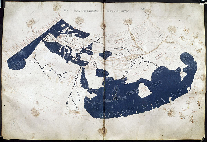
Claudius Ptolemy (100-170 A.D.), a mathematician, astronomer, geographer, astrologer and poet in ancient Greece, used a map projection to portray his concept of the structure of the earth. The illustration below, from the 15th century, portrays Ptolemy’s world as he saw it at the time.
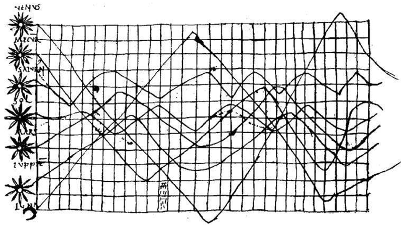
Much later in the 10th century, an unknown astronomer created what could be the first line chart illustrating planetary movements.
As data became more available in the 1500s and 1600s, early maps and diagrams continued to evolve. The next phase of infographics began in the 1700s as these rudimentary collections of data evolved into reams of information about everything from geography to weather to economics portrayed by new graphic forms.
The stories that follow give us a window into the lives of key influencers and the power of crucial turning points in the history of infographics.
William Playfair (1759-1823)
William Playfair is widely considered the inventor of most of the graphical forms of data visualization used today. He first created the line graph and bar chart, and next the pie chart and circle graph. As he began to develop more complex charts, Playfair created a chart that used two separate vertical scales to show taxes per capita in various nations arguing that the British were overtaxed.
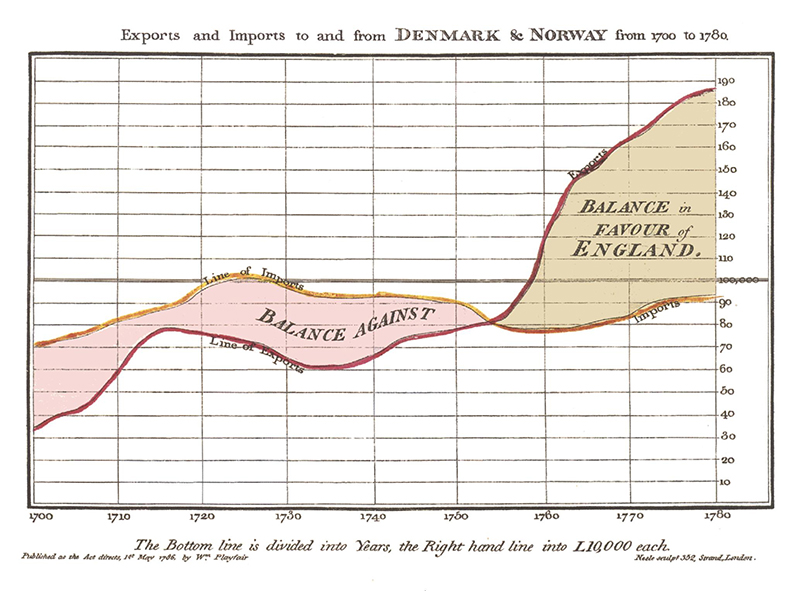
As Playfair wrote, data should “speak to the eyes.” He believed that human eyes were “the best judge of proportion, being able to estimate it with more quickness and accuracy than any other of our organs.” Further, Playfair argued that a really good data visualization “produces form and shape to a number of separate ideas, which are otherwise abstract and unconnected.”
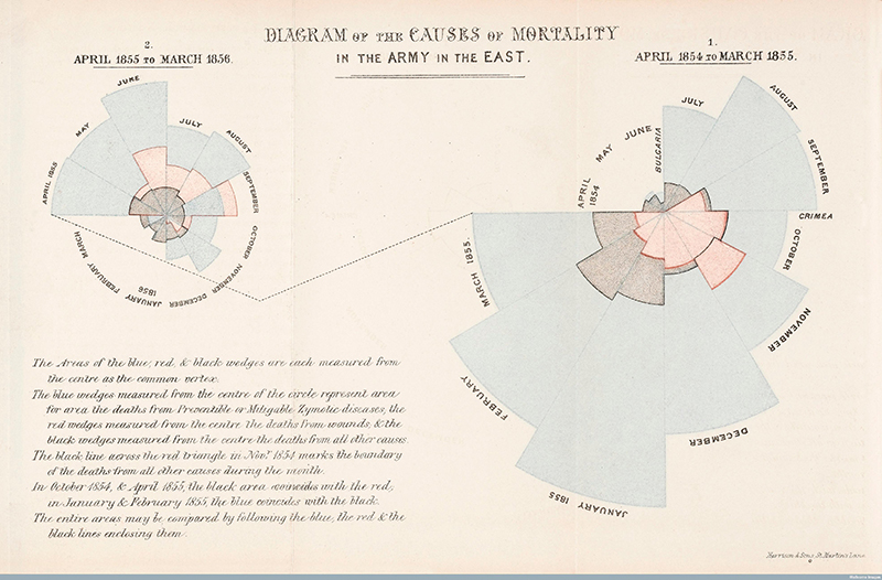
Florence Nightingale (1820-1910)
We think of Florence Nightingale as the founder of modern nursing, but she was first a brilliant statistician. Born in Florence, Tuscany, Nightingale took infographics to a commanding level when she created the polar area diagram to illustrate soldier deaths during the Crimean War of 1854-1855. During the Crimean war, more than 500,000 men lost their lives. Nightingale’s diagram illustrates both the dramatic rise of death and the disturbing causes of death during this brief six-month period.
As though to demonstrate how infographics changes people’s view of the world, Nightingale began training nurses to aid the injured soldiers she had found while researching this project in the Crimea. After the war, she went to England where she founded a nursing school at St. Thomas Hospital in London, making Nightingale the founder of modern nursing.
Slavery in the U.S.
In mid-19th-century America, slave maps illustrated the areas where slavery was most rampant and the Union army could then focus its effort. The maps used census data to illustrate the number of slaves in each county in a Southern state.
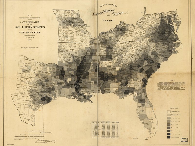
On an early map of Virginia, one trend that immediately jumped out was that while eastern Virginia was a hot-bed of slavery, western Virginia was virtually slave-free illustrating a military strategy: pit western Virginia against eastern Virginia. This breakthrough map led to a larger map of the South that influenced how the government viewed the warring nation through an understanding of where Southerners would be most, and least, eager to fight the North.
John Wesley Powell (1834 – 1902)
Reading about the growth of the western U.S. in the 1800s is like reading a science fiction novel about an apocalyptic time. According to Schulten, infographic maps drawn by John Wesley Powell, a civil war hero who had lost an arm in the fighting and was now leading heroic expeditions in the remotest areas of the west, could have influenced how the West was populated and how state boundaries were drawn. But the nation did not listen.
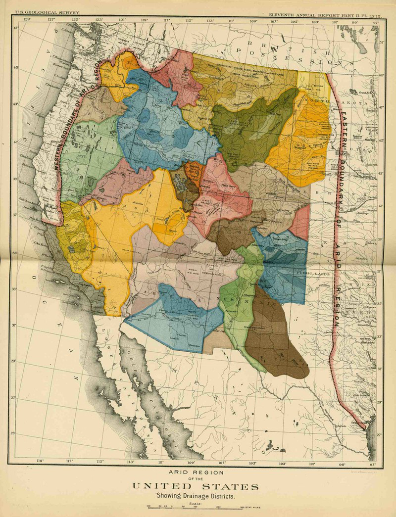
Powell was certain that the rush to settle the West was a disaster in the making. He believed that all decisions about settlement and politics should flow from the West’s watersheds and was inspired to use maps to divide the West’s arid regions. In a time when railroads were in control of arable tracts of land, John Wesley Powell, a U.S. soldier, geologist, professor at Illinois Wesleyan University and director of major scientific and cultural institutions, presented revolutionary ideas.
Conclusion
These stories, maps and infographics illustrate how data visualization influenced wars, economic theory and the growth of the most powerful nation in the world. The next post in this series will feature modern-day infographics.
And, I thought that would be it – a three-part series, right? But when I researched this post, I found an astounding array of resources for the modern-day infographic designer. So, stay tuned for a final post on infographic design that will provide many, many resources for you!
Sources
This post was influenced by an article by Clive Thompson in Smithsonian Magazine, July 2016, “The Surprising History of the Infographic.” Additional sources include A Brief History of Data Visualization by Michael Friendly and “This 19th Century Map Could Have Transformed the West” by Susan Schulten.
Visit Us Again!
Be sure to visit this blog every week to learn about the latest digital marketing trends, with a little history mixed in, too. And, follow me on Facebook, Twitter, LinkedIn, Pinterest, Google+ and tumblr for more information about social media and content marketing, or on Instagram for just plain beautiful photographs of the Arizona landscape.