Infographics Part III: The Evolution of Infographics into Deep Data Visualization
Even though the first infographic appeared 30,000 years ago on a dark, damp cave wall in southern France, in today’s fast-paced visual world, infographics are packed with data, painted with color, and move with history. Infographics have found their day in the sun.
But, what exactly is an infographic? Infographics are visual artworks that make massive amounts of data easy to understand and instantly fun to share. In the era of Big Data, infographics have grown from entertaining visualizations to a necessary tool for comprehension.
Ah! That sounds so simple, doesn’t it? But, in the modern day world, you will find that infographics are alive. In fact, you won’t find a lot of actual “story” in this post. Instead, you’ll connect dots, watch buildings light up in the dark, see statistics pop out of maps, and view the constantly changing world of the 2016 election.
There are a few graphics posted into this post, but mostly, you’ll want to follow the links and view these infographics and data visualizations directly. Sure, we’ll start with a little early history, but then we will launch into a mish mash of some of the most astonishing art you can find.
The Evolution of Infographics into Deep Data Visualization
When newspapers found themselves competing with television for visual impact, Peter Sullivan bridged the print infographics world of Florence Nightingale and the modern age of data visualization with his illustrated stories for London’s The Sunday Times.
Working in the 1970s, 80s, and early 90s, Sullivan used infographics to explain the sequence of events in major news stories, such as the image below which illustrated how the passengers and crew were rescued from the Zeebrugge ferry disaster.

After Sullivan, infographics evolved into data visualization, or dataviz, thanks to Edward Tufte, author of The Visual Display of Quantitative Information. Considered the 20th century’s best book on statistical graphs and now in its second edition and its 18th printing, The Visual Display of Quantitative Information launched the modern age of data visualization.
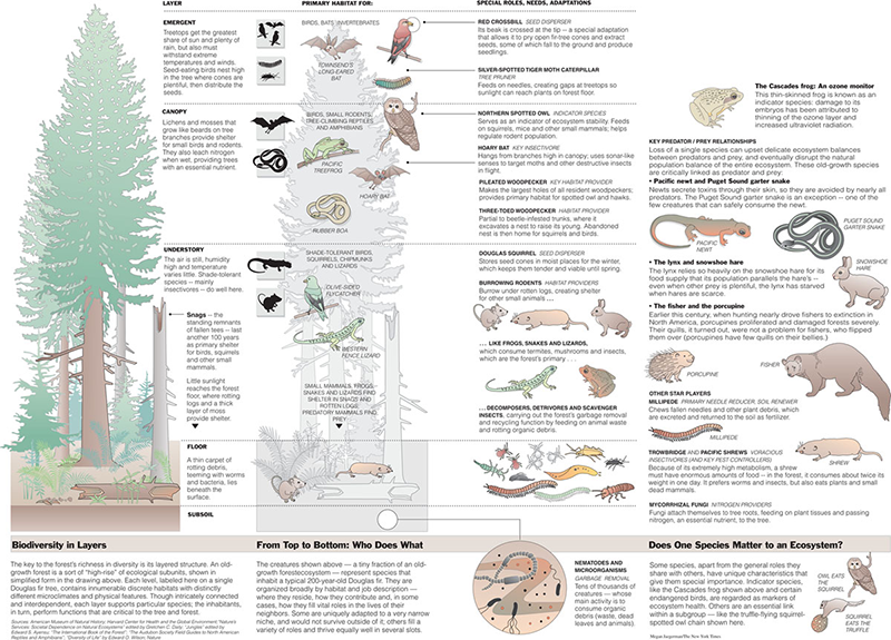
One of Tufte’s proteges, Megan Jaegerman, designed infographics for the The New York Times from 1990 to 1998. Described by Tufte as “smart, finely detailed, elegant, witty, inventive, informative,” Jaegerman designed complex infographics like this field guide which places plants and animals in their primary habitat.
Data Visualization Today
Data visualization is essentially a modern day refinement of art that started with the original cave wall infographics. While infographics are visual representations of facts, events, or numbers, data visualization is all about just the numbers. Data visualization heralds the path toward content marketing.
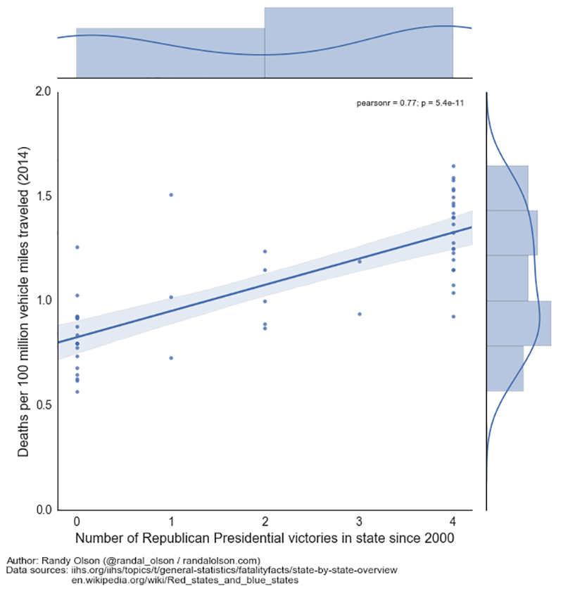
A master of data visualization, Randy Olson, senior data scientist with the University of Pennsylvania, populates his blog with complex infographics which are surprisingly easy to understand, like this one which points out that states with more Republicans have more traffic deaths.
Or, for a fascinating (or scary?) data visualization illustrating more about our bodies than maybe we want to know, click here for the Human Microbiome Project from The New York Times.
Internet Search as Infographic
Is the graphic below an infographic? I don’t know, but I sure love it! One of my favorite sites, Google, often posts clever images that play on the letters in its name, such as the image below from Oct. 24, 2016. If you see an image such as this one on Google, be sure to click on it for entertaining search results about obscure individuals, such as Antoni van Leeuwenhoek, a Dutch tradesman born 384 years ago on Oct. 24, 1632. It was Leeuwenhoek who discovered bacteria, free-living and parasitic microscopic protists, sperm cells, blood cells, and much more, bringing them to life in the newly discovered field of microbiology.

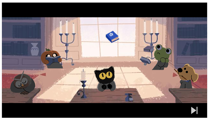
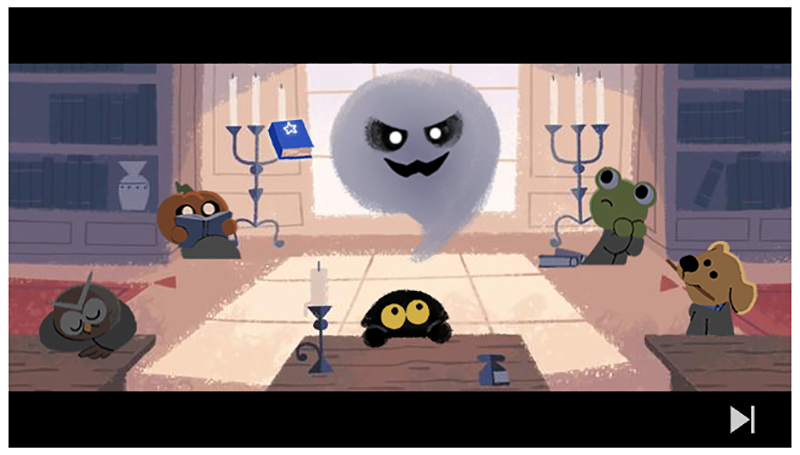
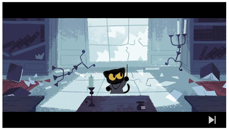
Or, for ghoulish Google search results, check out today’s video, Oct. 31, 2016 (Halloween in case you were wondering). But just in case you popped onto this post on Nov. 1, 2016, here are a few graphics from the video for your scary pleasure.
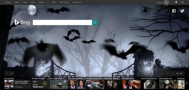
Here is one of my favorite interactive infographics: the Bing search page! Watch ghosts hovering or bats flying through lightning, and hover your cursor over the page for ghoulish sound effects. If you logged on to this blog after Oct. 31, then just use the feature at the bottom of the Bing search page to scroll backwards and find this Halloween post, or many other beautiful images.
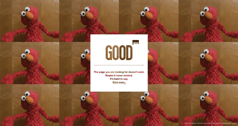
One of the most entertaining infographics is the modern-day 404 error page. A 404 error is the error you get when you perform a search, then click a link that takes you to a web page that no longer exists. Normally, the error message you receive is transcribed ad boring text. Or, you might see instead my favorite kitty.

Or maybe the cookie monster.
Or, this devilish tomcat.
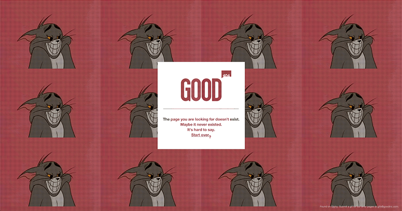
Check out good.is, and be sure to refresh the page often, to see more!
The Modern Age of Infographics
Representing one of the newest types of infographics, the “Blue Feed, Red Feed” provides infographic updates in real time using Facebook posts from both liberal and conservative sites.
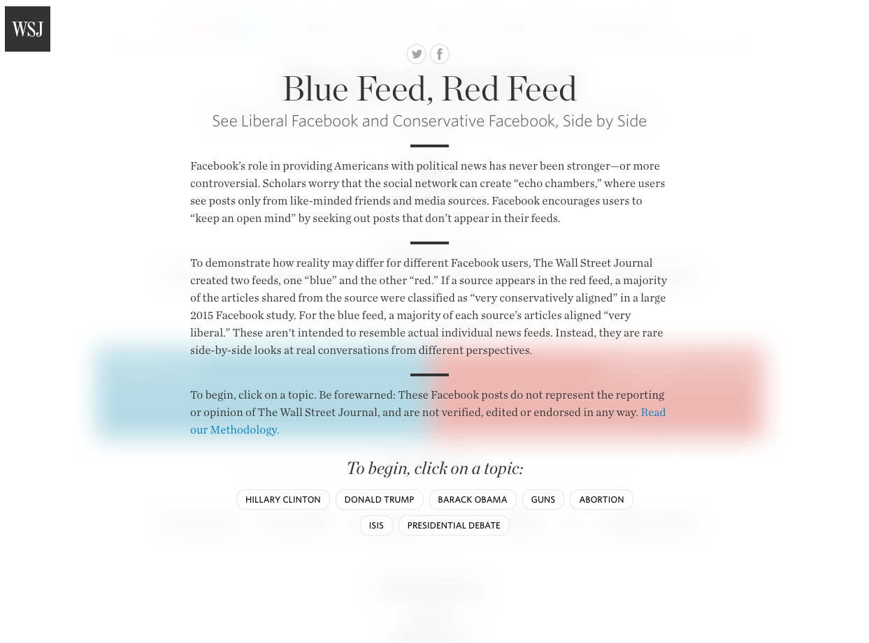 Published by The Wall Street Journal this spring, the posts on Blue Feed Red Feed change daily and represent opposing views from social media about politically charged topics ranging from Hillary Clinton and Donald Trump to ISIS.

TEDTalks about Infographics
Maybe my writing isn’t enough, though. Would you like to hear someone speak about modern infographics? You might start with this TEDTalk by David McCandless who uses simple diagrams to illustrate the answers to complex questions, like how the world’s debt during the 2008 financial crisis compares to other billion dollar figures.
Listen to Jed Thorpe talk about how he makes data human, for example, how he constructed the names on the 9/11 memorial in New York City so that they were laid out in terms of people’s relationships to each other.
Or, watch Hans Rosling as he delivers data visualization in time and debunks myths about global development.
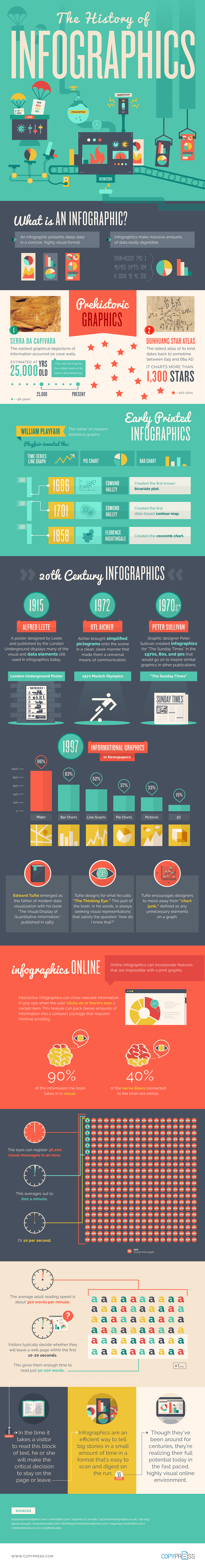
The History of Infographics
Last, but most definitely not least, the infographic below, from CopyPress.com, provides the entire history of infographics in, what else, an infographic!
We also want to always give credit where credit is due. Although I didn’t quote this blog here, this series was actually inspired by these short, simple one-minute stories about infographics from Shift Communications, a communications firm that specializes in data-driven public relations, called “Infographics Part I: The Rise and the Future” and “Infographics Part 2: Creating Impact with Strategy and Design.”
Stay tuned for a final post on infographics that will provide many resources for the reinvention of your infographic future!
Come Back and Visit Us!
Be sure to visit this blog every week to learn about the latest digital marketing trends, with a little history mixed in. And, follow me on Facebook, Twitter, LinkedIn, Pinterest and Google+ for more information about social media and content marketing, or on Instagram for just plain beautiful photographs of the Arizona landscape.